Visualising My Home Energy Automation: One Graph to Verify It All
I have solar panels, a Sigenergy SigenStor battery, and an Octopus Intelligent Go tariff: about 8p/kWh overnight (23:30–06:00, plus whatever slots Octopus's intelligent dispatching decides to grant) and roughly 35p/kWh the rest of the day. An automation flips the inverter's EMS mode to "Command Charging (PV First)" when the cheap window opens, and back to "Maximum Self Consumption" when it closes.
The question that bothered me: how do I know it's actually working? I could trawl through history graphs for the EMS mode, the rate, and the battery — or I could build one graph that tells the whole story at a glance.
The problem with separate graphs
My first attempt had three charts: power flow, upcoming rates, and battery/inverter power. Each was fine on its own, but verifying the automation meant cross-referencing three time axes mentally. Worse, the battery charge/discharge state lines and the inverter output were near-mirror images of each other (the inverter's output is mostly battery power), so half the pixels carried no new information.
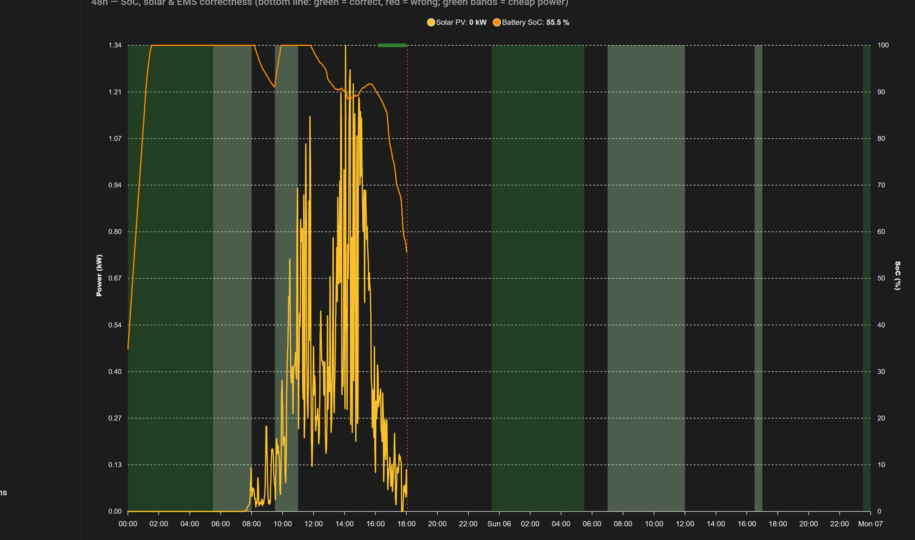
The fix was ruthless consolidation: one 48-hour chart with everything overlaid, hiding anything redundant.
What's on the graph
Reading it top to bottom:
- The correctness line (a thin 6px line hugging the top of the plot): green while the automation is doing the right thing, red the moment it isn't. It never renders into the future — it stops at the "now" marker. More on this below — it's the part I'm most pleased with.
- Tariff bands (green background bands): dark green for standard off-peak slots, light green for intelligent-dispatched slots. These aren't hardcoded to 23:30–06:00 — they're generated from the actual rate data Octopus publishes, so if dispatching shifts the cheap window, the bands follow automatically.
- Solar PV (yellow line): generation over the last two days.
- Battery SoC (orange line, right axis): the charge level. The shape tells the story — it should climb inside green bands and fall outside them.
Generating bands from live data
The bands are the interesting engineering bit. Rather than shading a fixed schedule, each band is an ApexCharts series whose data is generated from the Octopus rate event entities — filter the cheap slots, map them to [timestamp, value] pairs, and inject a null break between non-adjacent slots so the area doesn't bridge across gaps:
// inside the card's data_generator
const all = currentRates.concat(nextRates);
let lastEnd = 0;
for (const r of all) {
  if (r.value_inc_vat < 0.20 && !r.is_intelligent_adjusted) {
    if (lastEnd && new Date(r.start) - lastEnd > 60000) out.push([s - 1, null]);
    out.push([new Date(r.start).getTime(), 1]);
    out.push([new Date(r.end).getTime(), 1]);
    lastEnd = new Date(r.end).getTime();
  }
}
That null injection mattered more than I expected: without it, the area chart happily drew a straight line through every gap, and the "bands" became one solid green slab covering the entire background. With it, scattered dispatch slots render as distinct blocks.
The correctness line
The final piece came from asking a better question. Instead of "what mode is the EMS in?" (which produced a floating purple line I had to decode), the real question is "is the automation doing the right thing right now?"
That's a template helper sensor:
{% set rate = states("sensor.octopus_energy_electricity_..._current_rate") | float(1.0) %}
{% set mode = states("sensor.ems_mode_numeric") | int(0) %}
{% if rate < 0.20 %}
  {{ 1 if mode == 2 else 0 }}
{% else %}
  {{ 1 if mode == 1 else 0 }}
{% endif %}
Cheap rate and charging (or expensive rate and self-consumption) → 1. Anything else → 0. Because the rate sensor is recorded by Home Assistant's history, the correctness sensor is judged against real historical prices — including dispatch slots that appeared mid-day. The line is drawn at 97% of the SoC axis — effectively hugging the top of the plot — as two overlapping series: a green one that's non-null while the sensor reads 1, and a red one that's non-null while it reads 0. Each series' transform nulls out the other state, so only one colour is ever visible at any timestamp. Any red stretch is a timestamped "the automation misbehaved here".
The line only has history since the helper was created, so in the screenshot it starts partway through day two and stops at the "now" marker — the chart never pretends to know the future. After one full overnight cycle it tells a complete story.
Lessons from the build
A few things I learned the hard way, mostly by reading the card's minified source when configs mysteriously errored:
- Panel-view dashboards render exactly one card. Wrap multiple cards in a
vertical-stack. - Strict schema validation rejects unknown keys — a
fill_valuewhere the card expectedfillsilently broke the whole page. data_generatorseries must opt out of bucketing. The card's defaultgroup_by: avg/2minbridges null gaps unless a band series setsgroup_by: {func: raw}.- Translucent areas stack colours. A 50%-opacity solar area over green bands reads as two different colours; opaque fill fixed it.
- Y-axis ranges are the whole game. The band axis is fixed 0–1 (so bands are full height) and SoC is pinned 0–100 regardless of the power axis' auto-scaling. The correctness line rides the SoC axis at 97 — hugging the top of the plot with no extra hidden axis.
The stack: Home Assistant with the Octopus Energy and Sigenergy integrations, two template helpers, and an apexcharts-card — roughly 150 lines of dashboard YAML for the whole thing.